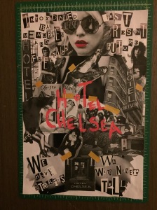
I was loving this project. My only complaint is I feel I didn’t have enough time to properly explore all my possibilities and brainstorm ideas. A week isn’t very long to pick a design style, a product, a design concept and to properly execute that concept. I found that another week would have been very desirable. That said I’m pretty happy with how mine turned out.
I quickly decided to pick dadaism as my style. Although the other styles appealed to me, I’ve never really worked with collage and was excited for the challenge and opportunity. Also, the whole concept behind dadaism fascinates me and I wanted to see what it’d be like to make non art art and have to sell something using this style.
I chose the Chelsea Hotel as my product, my poster is meant to appeal to the young partiers. Much as the party hostel appeals to travelling backpackers. I wanted my poster to celebrate the hotel’s noteworthy past of celebrities and notoriety and give off the vibes that if you want to party and make history this hotel is where you want to be (the alligator head was added in a dadaism nonsensical however one of the previous longterm tenants at the hotel also had two pet alligators he kept in his room… ).
All in all I am happy with how my project turned out. As I said before more time would have been appreciated, if i could have gone back i would have made the pink hotel chelsea title bigger. I didn’t before because i didn’t want to cover up too much of the background but I think that was the wrong choice. That said, all in all I’m happy with it though, I would give myself an 8 or 8.5
